本記事のデータはGitHub - computational-sediment-hyd/storageFunctionにあります。
![]()
![]()
観測された降雨データの多くは前○時間平均で整理されています。
前○時間平均とは、例えば、1時間間隔の観測データで1/1 12:00の観測値が、1/1 11:00~12:00の平均値を示すことです。
ポイントは2点
- alignを"edge"とする。
- barの起点は標準ではcenterのためedgeにする。
- widthを-サンプリング時間/24とする。
- 時間軸の場合、width:1が1日となる。そのため、サンプリング時間(hr)/24とする。
- widthは起点からx軸の+方向に設定するため、前平均を考慮すると-標記になる。
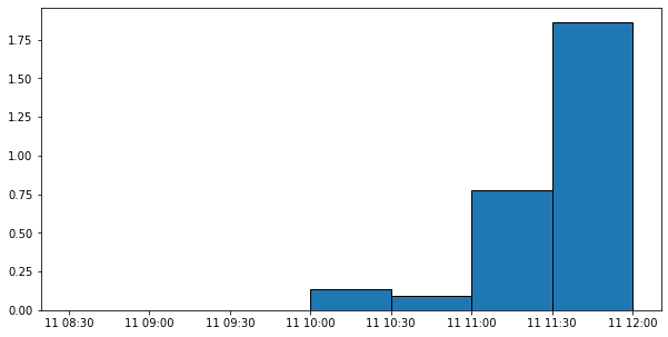
サンプルとして、30分間隔の雨量データのグラフを書いてみる。
import pandas as pd
dfrain = pd.read_csv('rain.csv', index_col='date', parse_dates=True)
dfrain
| rainfall | |
|---|---|
| date | |
| 2019-10-11 09:00:00 | 0.000000 |
| 2019-10-11 09:30:00 | 0.000000 |
| 2019-10-11 10:00:00 | 0.000000 |
| 2019-10-11 10:30:00 | 0.132632 |
| 2019-10-11 11:00:00 | 0.090526 |
| ... | ... |
| 2019-10-14 06:30:00 | 0.202105 |
| 2019-10-14 07:00:00 | 0.235789 |
| 2019-10-14 07:30:00 | 0.231579 |
| 2019-10-14 08:00:00 | 0.117895 |
| 2019-10-14 08:30:00 | 0.261053 |
144 rows × 1 columns
import matplotlib.pyplot as plt
fig, ax = plt.subplots(figsize=(10,5))
ax.bar(dfrain.index[:7], dfrain['rainfall'].values[:7].flatten(),  edgecolor="k", width=-0.5/24,  align="edge")
ax.xaxis_date() #自動で型を判断するため無くても良いが、念のため記述。
plt.show()
ついでに流出解析っぽい絵(y軸を2軸、降雨の軸を反転)も書いてみる。
ポイントは、
- x軸を共有してy軸を2つ設定する。
- 降雨軸のylimを(最大表示範囲、最小表示範囲)に設定する。
です。
dfQ = pd.read_csv('宮ヶ瀬ダムobs.csv', index_col='date', parse_dates=True)
dfQ= dfQ['2019/10/11':'2019/10/14']
dfQ
| 流域平均雨量[mm/h] | 貯水量[×10^3 m3] | 流入量[m3/s] | 放流量[m3/s] | 貯水率[%] | |
|---|---|---|---|---|---|
| date | |||||
| 2019-10-11 00:00:00 | NaN | 138326.0 | 2.41 | 0.00 | 100.0 |
| 2019-10-11 01:00:00 | NaN | 138367.0 | 5.04 | 0.00 | 100.0 |
| 2019-10-11 02:00:00 | NaN | 138408.0 | 8.19 | 18.86 | 100.0 |
| 2019-10-11 03:00:00 | NaN | 138367.0 | 8.19 | 18.96 | 100.0 |
| 2019-10-11 04:00:00 | NaN | 138326.0 | 5.19 | 19.12 | 100.0 |
| ... | ... | ... | ... | ... | ... |
| 2019-10-14 19:00:00 | NaN | 173298.0 | 39.80 | 55.52 | 100.0 |
| 2019-10-14 20:00:00 | NaN | 173255.0 | 38.30 | 55.51 | 100.0 |
| 2019-10-14 21:00:00 | NaN | 173211.0 | 39.80 | 55.56 | 100.0 |
| 2019-10-14 22:00:00 | NaN | 173168.0 | 35.97 | 44.56 | 100.0 |
| 2019-10-14 23:00:00 | NaN | 173124.0 | 35.66 | 44.52 | 100.0 |
96 rows × 5 columns
import matplotlib.pyplot as plt
import pandas as pd

fig, ax = plt.subplots(figsize=(10,4))
ax2 = ax.twinx()

ax.plot_date(dfQ.index, dfQ['流入量[m3/s]'].values, label='Qobs', linestyle='None', marker='o', color='none', markeredgecolor='black')
ax.set_ylim(0,4000)

ax2.bar(dfrain.index, dfrain['rainfall'].values, label='rainfall',  edgecolor="k", width=-0.5/24,  align="edge")
ax2.set_ylim(150,0)

h1, l1 = ax.get_legend_handles_labels()
h2, l2 = ax2.get_legend_handles_labels()
ax.legend(h1 + h2, l1 + l2)
plt.show()

リンク